What Victoria Beckham’s emails get right (and what premium and luxury brands can learn)
The Beckhams are never not in the news. But recent events - from Brooklyn’s departure from Brand Beckham (sad face) to Victoria being honoured in Paris with the Chevalier of the Order of Arts and Letters (happy face) - piqued my curiosity about the CRM strategy behind her fashion brand.
So let’s take a look.
The Welcome Series
A welcome series is often seen as the foundation of email automation. It’s where brands introduce their story, set expectations, and guide new subscribers towards a first purchase.
Victoria Beckham takes a more editorial approach.
Rather than relying on heavy automation or incentives, her emails lean on clarity, consistency and creative confidence. The result is a CRM strategy that feels calm, considered and unmistakably premium.
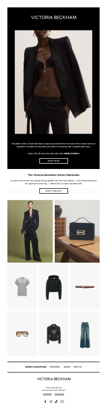
Email 1: Welcome to Victoria Beckham
The welcome email opens with striking, minimalist imagery and very little copy. The focus is immediate and intentional. This is the world of Victoria Beckham, and the aesthetic does the heavy lifting.
Product is introduced carefully, with a small curated grid rather than an overwhelming catalogue. The CTA is simple and unfussy, inviting exploration rather than pushing conversion.
What works well here is restraint. There’s little urgency. Instead, the email establishes tone, taste and trust.
I was surprised to see generic Welcome 10% off code here, as not many luxury brands offer them. I’d recommend making this code unique, so it feels more exclusive and can’t be shared.
Other elements I’d consider refining
Add a short line setting expectations for subscribers, such as what they’ll hear about and how often (although this did come in the second email in the series)
Add light context above the product grid to guide browsing. Hopefully these are best selling products, which are an effective way to direct new subscribers to discover and shop for the first time.
Adding a final CTA at the bottom of the email, so users don’t have to scroll back up to shop.
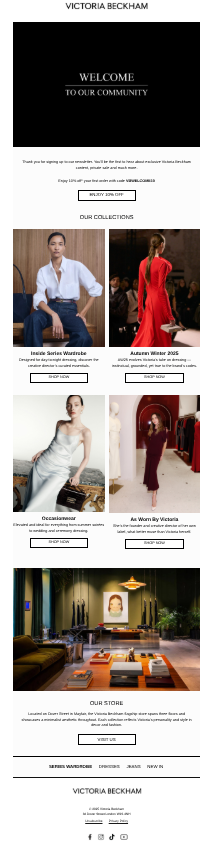
Email 2: Get to know Victoria Beckham
Two days later, subscribers receive a brand-led follow-up. This email expands the story beyond product, spotlighting collections, runway moments and physical retail.
It’s a smart second step. Rather than rushing customers toward a purchase, it deepens understanding of the brand universe and reinforces credibility.
This is onboarding done quietly but effectively.
It’s smart to include the store here, grounding the brand in a physical experience as well as a digital one. The only refinement I’d suggest is making the lead image more engaging and inspiring. A gif could work beautifully, bringing together the different facets of the brand highlighted in this email and adding a sense of movement without detracting from the premium feel.
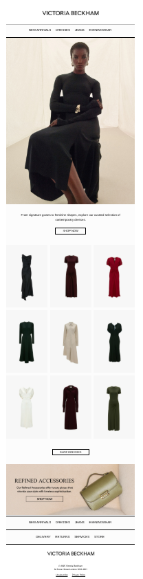
BAU Campaign: All Dressed Up
Moving into BAU, category-led emails continue the same disciplined approach.
“All Dressed Up” focuses entirely on dresses. One hero image leads, followed by a clean grid that makes browsing effortless. There’s no unnecessary copy, no competing messages and no pressure to act quickly.
Dresses are clearly a core category for Victoria Beckham, as they are for most womenswear brands, so leading with a dedicated dresses edit makes perfect sense. It’s also smart to include a banner at the bottom highlighting a complementary category, giving customers a secondary route to explore without distracting from the main story. The design hierarchy works well here, making it clear this is a supporting message rather than the hero focus.
One thing I did notice is that because the subcopy and CTA sit within the accessories image banner, these elements appear smaller on mobile than the rest of the email. Using live text could improve legibility without compromising the design.
It’s also interesting to see navigation links placed both at the top and bottom of the email. Increasingly, brands are moving navigation closer to the footer to keep the top of the email visually clean. As always, this is an area worth A/B testing and reviewing heatmaps for, to understand where customers are actually clicking.
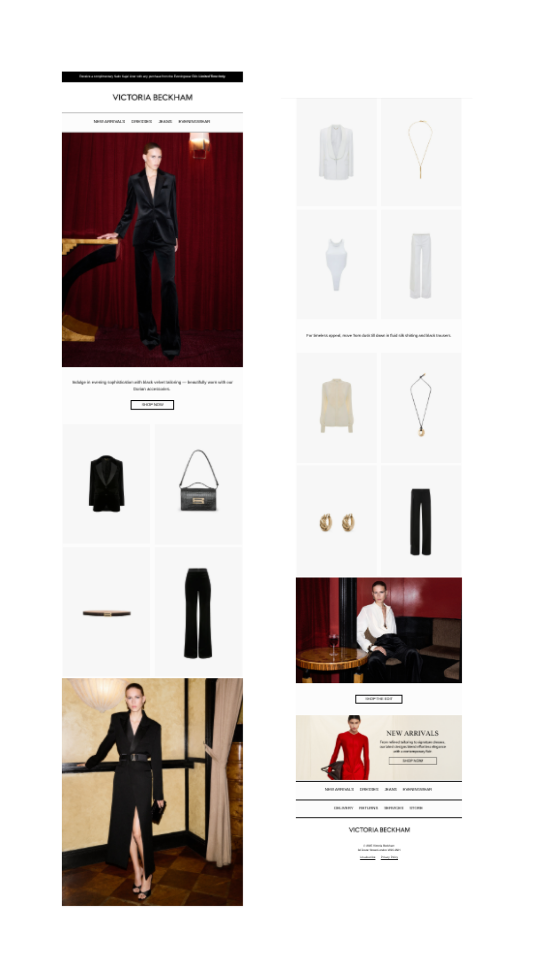
Longer-form BAU: Structured suiting
This campaign shows how Victoria Beckham stretches a category story without diluting it.
Split into visual chapters, the email reads more like a digital lookbook than a retail send. Editorial imagery leads each section, with clean product grids giving every piece room to breathe.
Short, purposeful copy frames the category without over-explaining. The repetition of layout and structure improves usability while reinforcing familiarity.
Why it works
By structuring the email in visual chapters rather than a dense product grid, engagement feels more natural and considered.
Fewer products elevate perceived value
Repetition builds confidence, not fatigue
What I’d refine
Add a subtle styling cue or occasion-led line
Vary CTA language slightly to maintain the editorial feel
The Bigger Picture
Victoria Beckham’s emails succeed because they know exactly what they are.
There are no urgency tactics and no overcrowded layouts. Instead, the strategy relies on:
Strong creative direction
Clear category authority
Emails that are structured and spaced to feel considered, not hurried
This is CRM that supports the brand rather than shouting over it.
The takeaway for premium and luxury brands
Email should feel like an extension of your brand world
Consistency builds trust faster than constant reinvention
Category-led campaigns work best when they are curated, not crowded
Restraint can be a conversion strategy in itself
If you’d like expert eyes on how your email strategy could evolve with this level of clarity and confidence, let’s talk.